Within the PowerPoint examples of flat design, there was one that was a reimagined poster for Iron Man, in my opinion, I think it was inspired by the first Ironman movie. After digging a bit, I discovered the poster was created by Moritz Schmitt, an inspired designer who began creating work due to his love for movies, tv shows, comics, games, and "all other geek stuff." He creates marvel-inspired posters and has a DC collection that includes characters such as Batman, Joker, Nightwing, Deathstroke, Flash, etc. Going further he has also created more collections that are inspired by shows and movies. These include Star Wars, The Simpsons, Transformers, Super Mario Bros, and characters from Mortal Combat. This is the link for this page to see all his work... https://www.behance.net/gallery/23315939/Minimalistic-Flat-Design-Comic-hero-poster
Schmitt, M. Thor (Poster), 2015. Behance.
https://www.behance.net/gallery/23315939/Minimalistic-Flat-Design-Comic-hero-poster

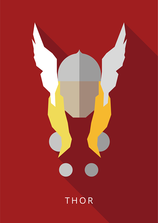
Similar to the Ironman poster, Thor sticks to a similar color palette but also the color palette unique to Thor's character. Compared to Ironman, this Thor poster doesn't have as much negative space but still enough to keep your eyes focused on the recreation of Thor's head. In a later entry, I plan to discuss Schmitt's Hulk and Venom pieces to compare a contrast a few things, but in this piece, the only depth is shown in the shadow coming off from the buttons and the top of his head. Compared to come of this other work, this piece has a bit more detail and pieces of the character to really show who it is. Compared to Schmitt's Ironman, Thor has a little more detail, in my opinion, he added the buttons as this detail. I would say without the buttons, you would be able to know who the character depicted is but I think the buttons just add to the poster and still keep it very minimal. The typeface that says "Thor," is a simple sans serif font that can be found in the adobe fonts area/store but using this typeface helps keep the design to a minimal because nothing too crazy is going on.


Comments
Post a Comment